
December 11th, 2016
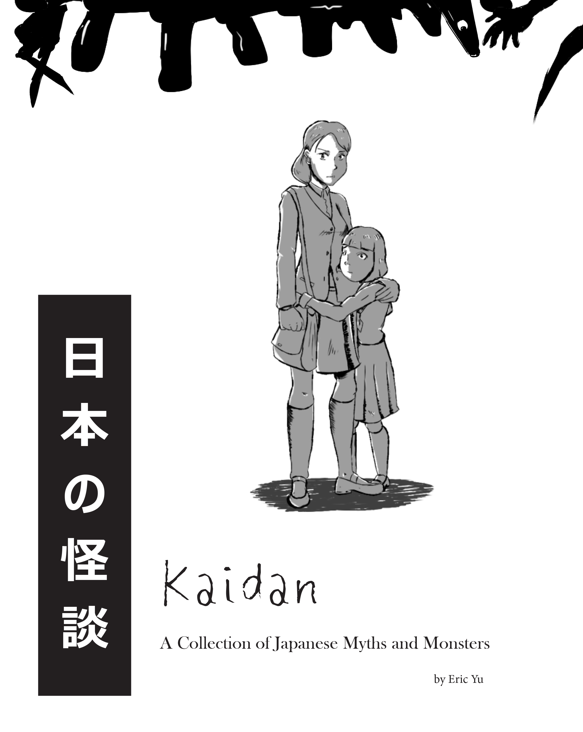
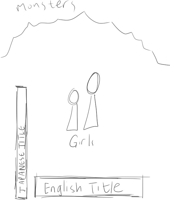
Kaidan: A Collection of Japanese Myths and Monsters is a story book I made which covers scary Japanese myths and urban legends. Following the Shimada sisters, readers learn about different Japanese ghost stories, with all of the text and artwork done by myself.
Conception
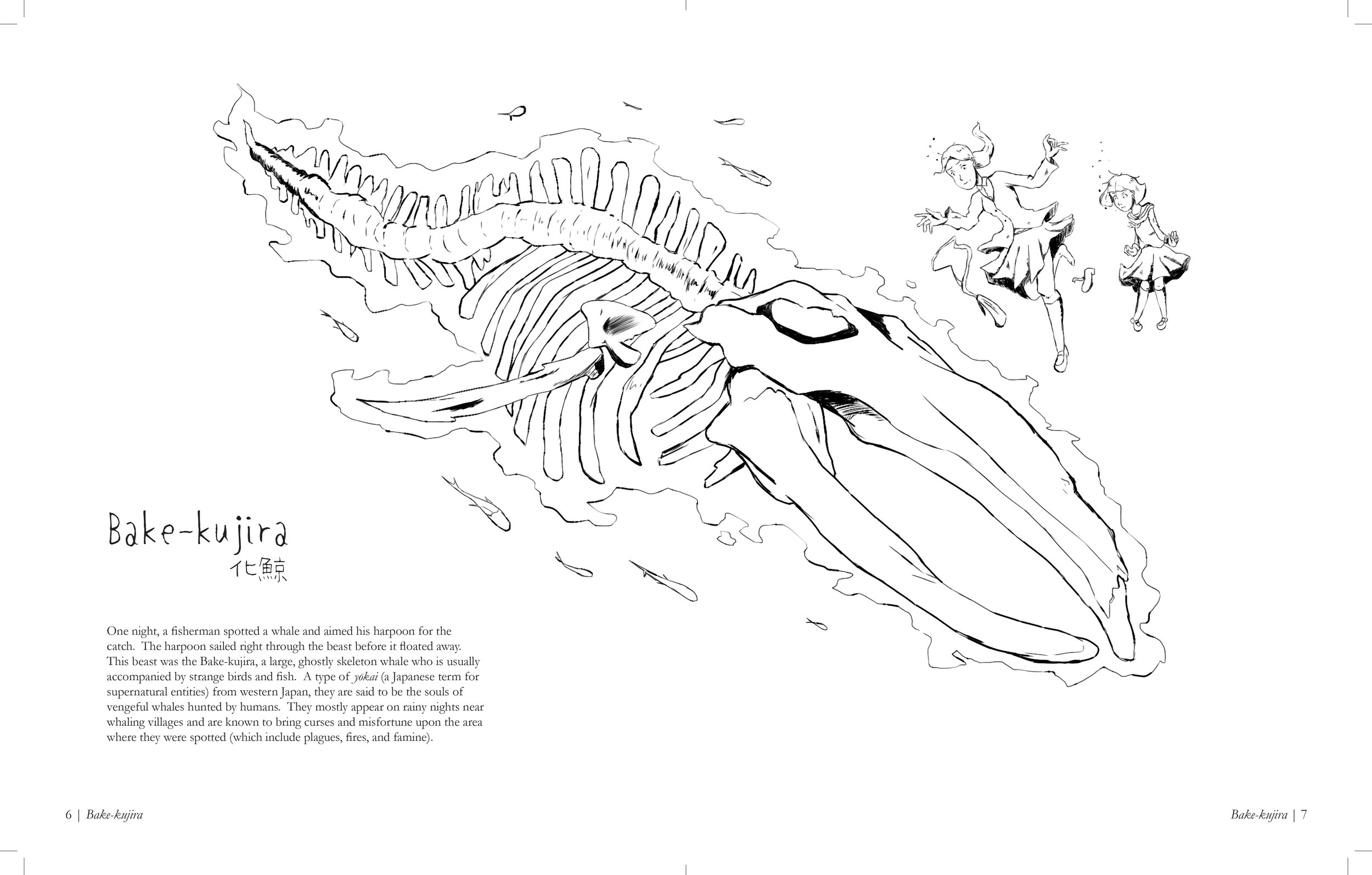
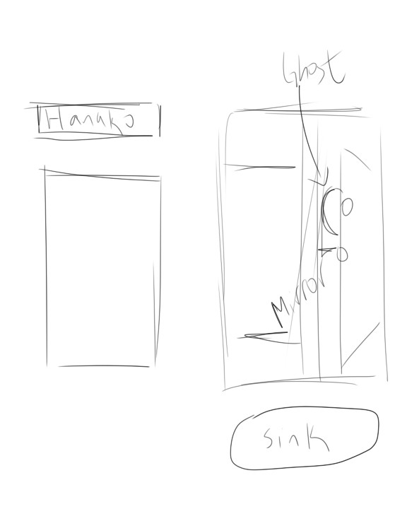
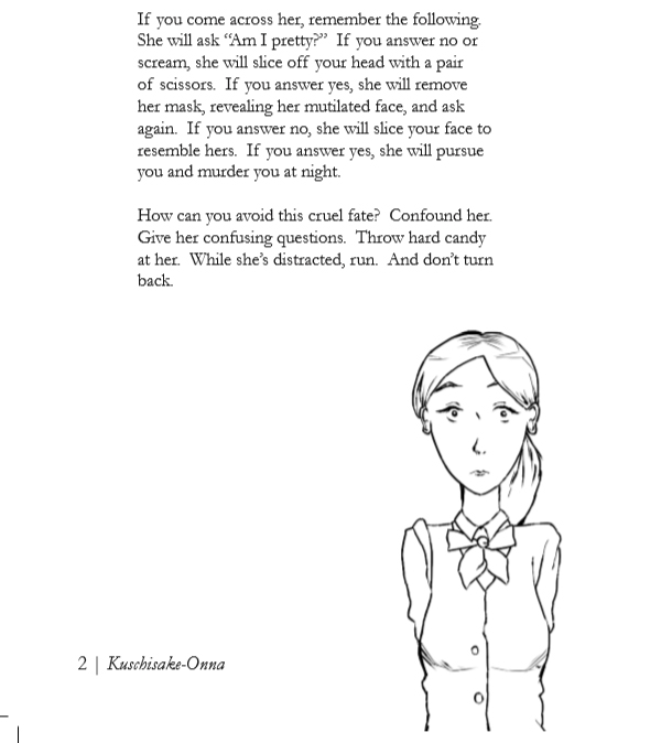
I wanted to make a book with illustrations (especially since photographs are not my forte and I like to do animation). Styles that immediately inspired me were Quentin Blake’s illustrations from Roald Dahl’s books as well as Shel Silverstein’s illustrations, especially since they involved very simple line drawings. I originally thought that I would be doing some sort of children’s book, with legends and fairytales, but the more legends I found the more I enjoyed the scary ones. I decided to do one or two monsters from every country (such as the chupacabra and the Jersey Devil). However, the strange tales that were Japanese monsters (like monsters that reside in the toilets and one that carries a surgical mask and a scissor) really steered me towards making a book about Japanese horror. The black and white really complimented the theme, as I took hints from the drawing styles of Junji Ito’s horror manga.

Shel Silverstein only used simple black and white line drawings, which I feel complemented his poems very well.

Junji Ito's Uzumaki. I wanted to emulate the sense of creepy uneasiness in his manga.

Quentin Blake's illustrations in Roald Dahl's books, such as The BFG, were very simple but portrayed a lot of emotion.
Preliminary Sketches


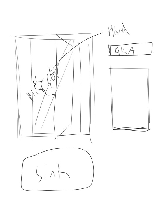
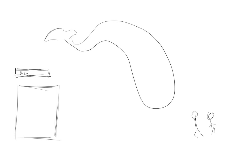
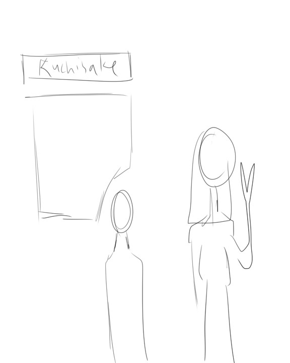
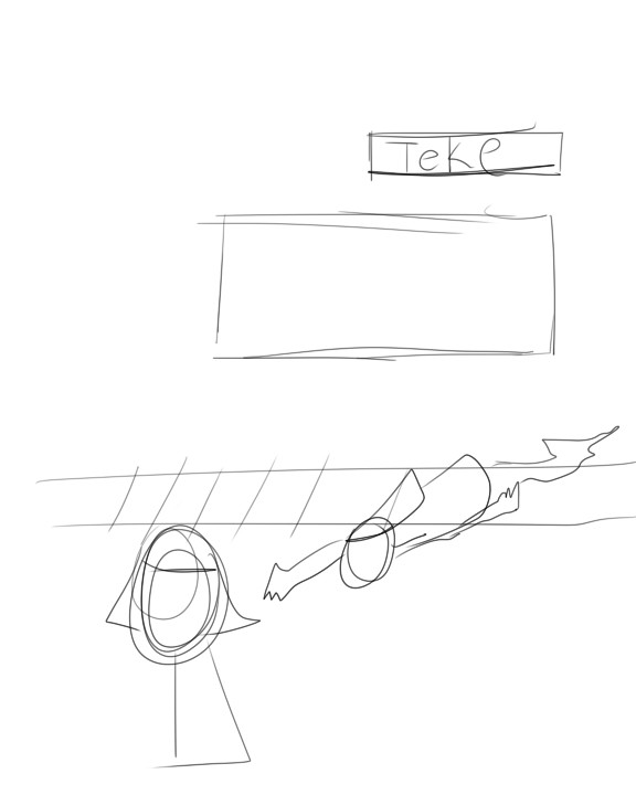
I took a lot of inspiration from Shel Silverstein’s illustrations from his poetry books; just a simple block of text with an associated drawing to complement it. I included a map, as this was before my decision to just include Japanese monsters. I also decided to include some sort of character to interact with the monsters, so as to draw comparisons with monsters and humans as well as providing a unifying theme throughout the book. I decided to make some sketches for this human character.
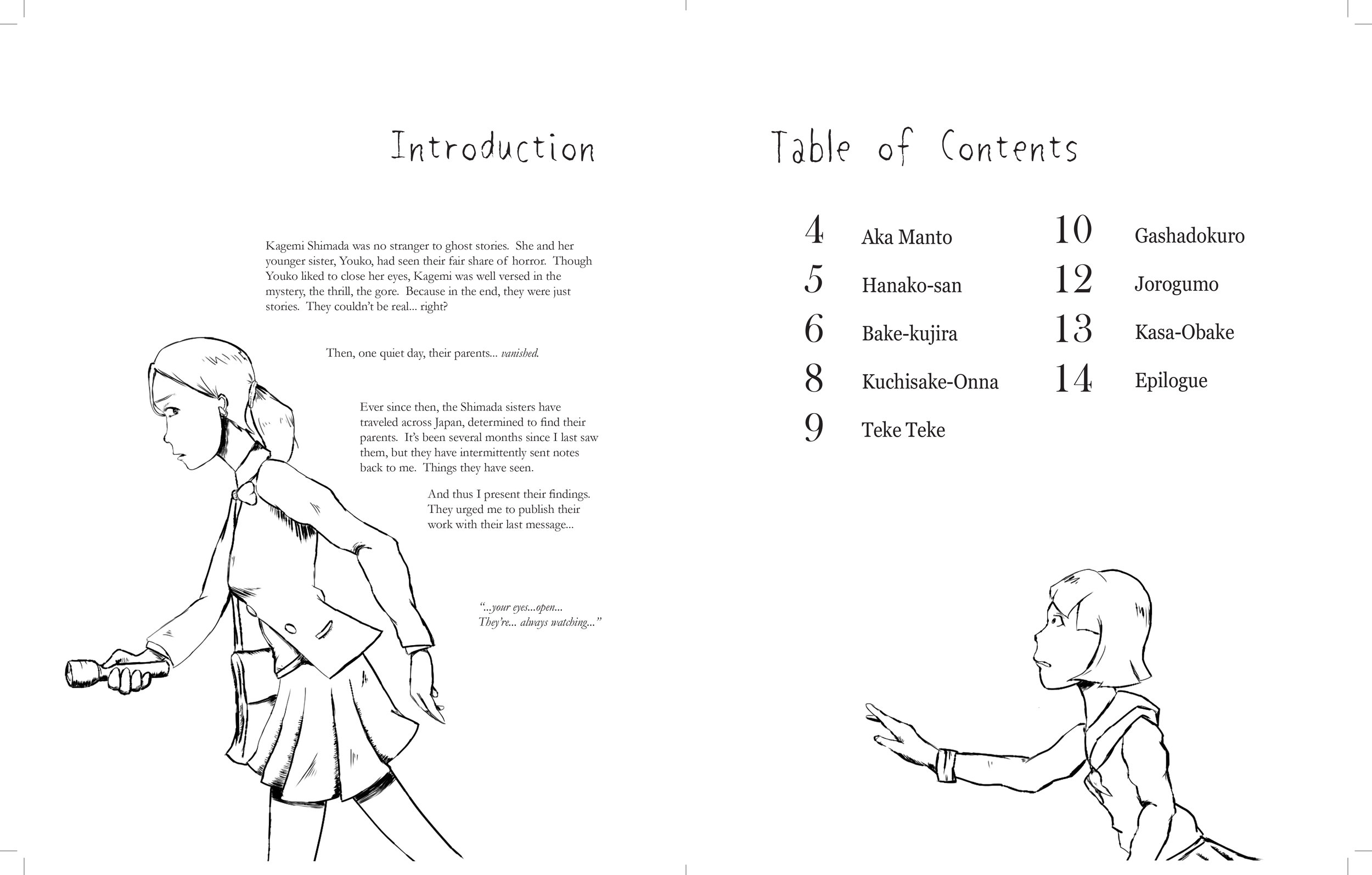
Since the book will be on two page spreads, I decided to use two sisters; one for each page. One would be a brave older sister whereas one would be a shy younger sister, to show a difference in reactions. I experimented with many looks for these sisters, from more cartoonish to more realistic, before doing some mix between the two. I looked at Junji Ito’s characters for inspiration on design.

Sketches of the older sister. I tried to make her seem brave, yet caring.

Sketches of the younger sister. I tried to make her shy and somewhat scared, but willing to do what needed to be done.
First Iteration

I made my first spread in InDesign, with the illustrations done in Paint Tool Sai and Photoshop. With the brush, I tried to make them look like pencil or rough ink, to complement the look of theme, as well as the title font (Shigoto Memogaki, which works with Japanese characters). For the body I used Garamond, as the serif makes it easier to read and complements the horror feel as well.
Critiques on First Iteration
Based on feedback from my peers, there were several pros and cons to my initial spread.
Pros:
People like the simple hand drawn-esque design, especially illustration style. Some people liked the black and white style, saying it made the piece very asian inspired.
Cons:
Some people wanted color to complement the drawings. In addition, the off centered alignment of the Japanese characters confused some people, and text didn’t really interact with the drawings well. Plus, since the paragraph on the second page was right aligned, the left rag of the paragraph made it hard to read. In addition, some of the outlines for the character drawings were a bit too thin, making them hard to see.
Intermediate Iterations
I redrew the illustrations to see if thicker lines would make the drawings easier to see
Based on feedback from the critiques I got, I changed up the drawing style of my characters. I quadrupled the brush size so that they would appear more clearly on the paper.


In addition, I experimented with justifying my text as well as indenting the paragraphs. I wasn’t a huge fan of these changes, so I stuck with left aligned paragraphs.


In addition, I went about finishing the other drawings as well as the cover. I wasn’t sure what to do with the cover; whether to make it stark like the rest of the book or whether to make it bold and powerful. I stuck with the stark look, so as to keep with the style of the rest of the book.
Final Iteration
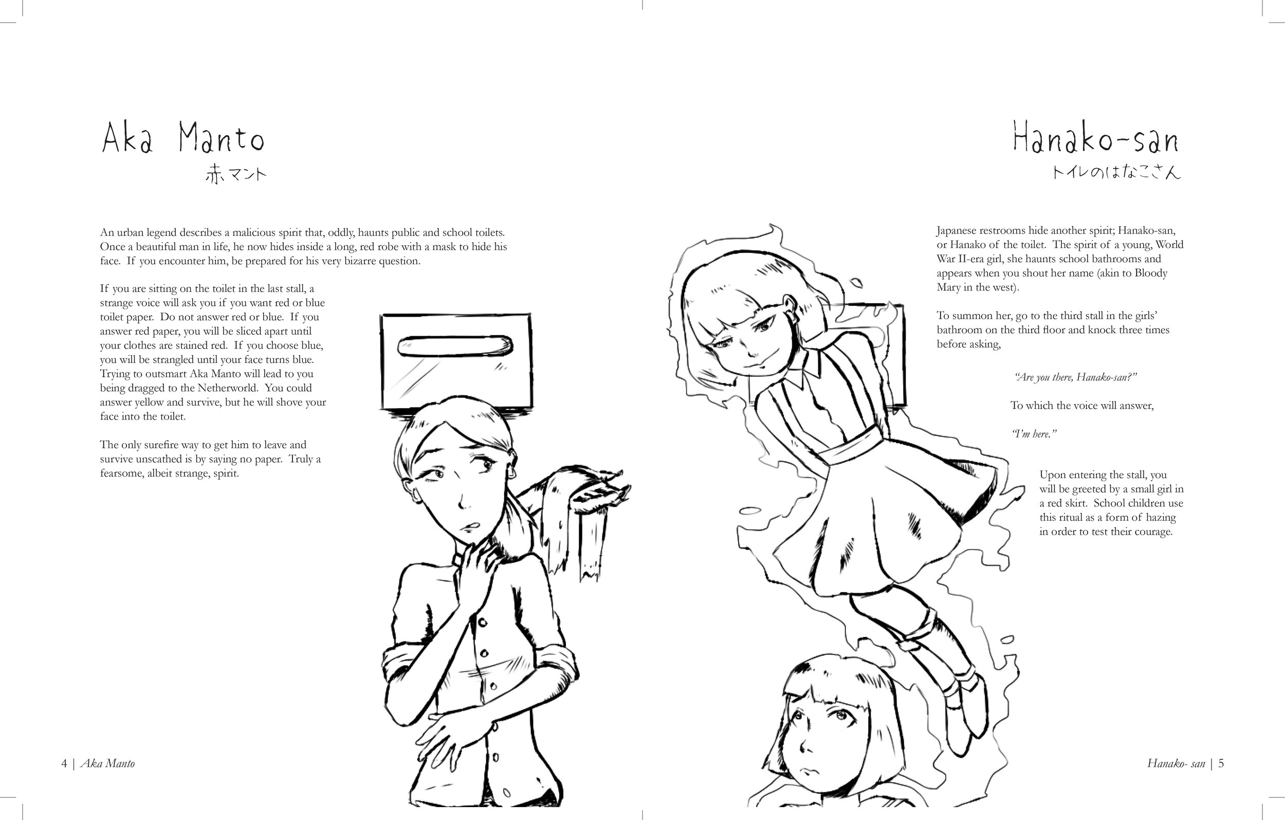
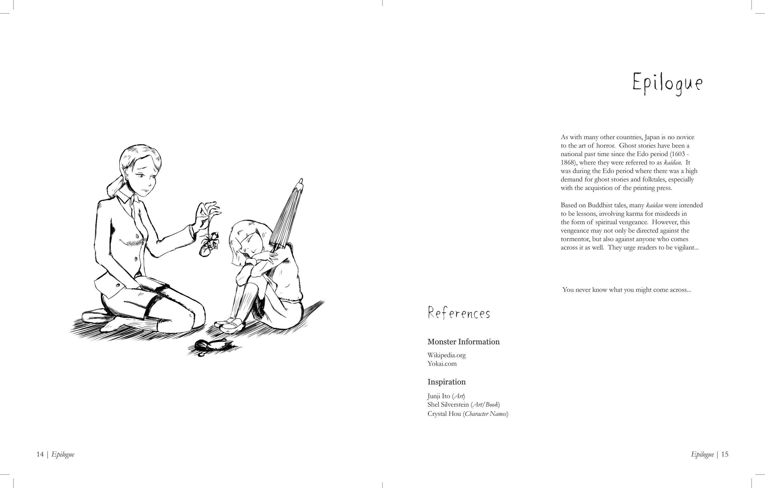
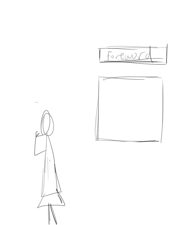
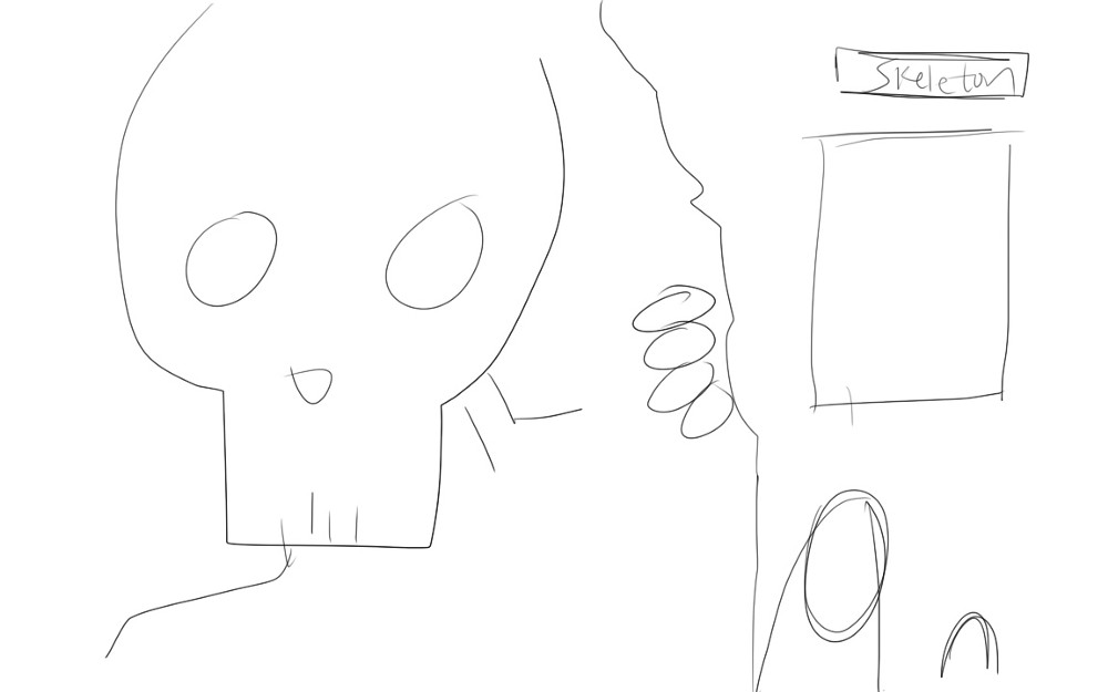
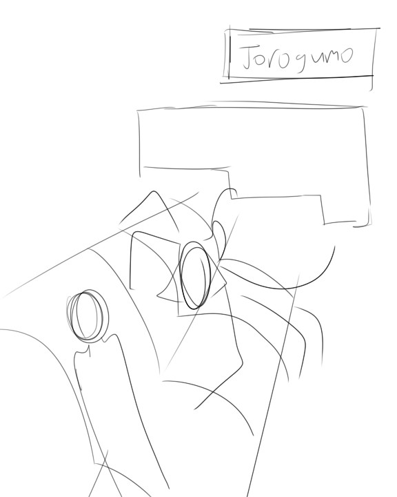
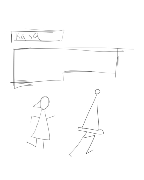
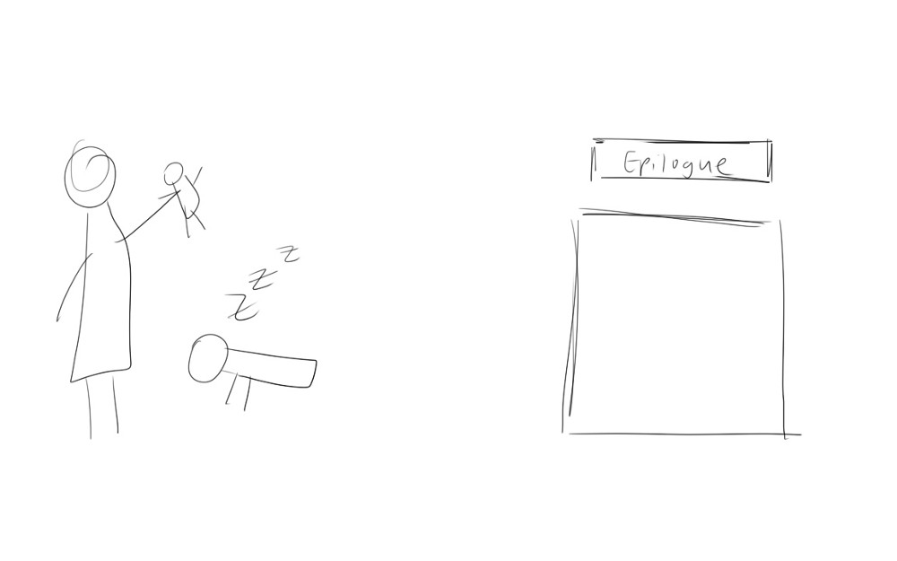
Based on these iterations, I developed my final version. Having done a book with 8 monsters, I made a prologue with a short story to explain the girl characters. The epilogue I made described the origin of Japanese ghost stories called kaidan. I felt these parts were needed to give more background of the stories in the book. In addition, I tried to provide more interaction between the text and the illustrations.
Final Thoughts
Overall, I had a lot of fun with this project. It allowed me to combine many passions I had (drawing, Japanese media, book layout) and turn it into something that I could physically turn the pages of. I learned a lot about book layout and design and I hope to employ these skills that i have learned in future projects.